

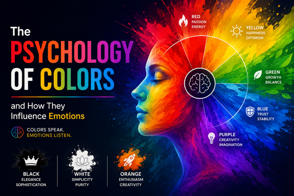
As designers, artists, storytellers, and creatives, understanding the psychology of colors helps us create work that connects deeply with people. Whether you’re designing a website, creating artwork, decorating a space, or building a brand identity, the colors you choose communicate emotions before words are even read.
Colors are more than just beautiful visual elements — they are powerful emotional triggers. The colors we see every day can influence our mood, decisions, energy levels, and even the way we interact with brands, designs, and environments. From the calming effect of blue skies to the excitement created by bold reds, color psychology plays a major role in human experience and creative expression.
What Is Color Psychology?
Color psychology is the study of how colors affect human emotions, behaviors, and perceptions. Different colors naturally create different emotional responses. Some colors inspire calmness and trust, while others create excitement, urgency, passion, or creativity.
Brands, marketers, artists, and designers use color psychology intentionally to shape how people feel and respond.
For example:
- Restaurants often use red and yellow because they stimulate appetite and energy.
- Luxury brands use black and gold to communicate elegance and sophistication.
- Wellness brands use green and blue because they feel calm, natural, and refreshing.
Colors silently speak to the human mind.
How Different Colors Influence Emotions
Red — Passion, Energy, and Power
Red is one of the strongest emotional colors. It represents passion, excitement, strength, love, and urgency. It instantly grabs attention and increases energy.
Red is often used in:
- Sales and promotions
- Sports branding
- Romantic themes
- Warning signs
Too much red, however, can feel aggressive or overwhelming.
Blue — Trust, Peace, and Stability
Blue creates feelings of calmness, reliability, trust, and professionalism. It is one of the most universally loved colors.
Blue is commonly used by:
- Technology companies
- Banks
- Social media platforms
- Healthcare brands
Light blue feels peaceful and soft, while dark blue feels strong and dependable.
Yellow — Happiness and Optimism
Yellow is bright, cheerful, and energetic. It symbolizes positivity, warmth, creativity, and hope.
Yellow works well for:
- Friendly brands
- Creative designs
- Children’s products
- Inspirational content
Because it is highly stimulating, too much bright yellow can sometimes feel intense.
Green — Growth, Nature, and Balance
Green is associated with nature, freshness, healing, health, and peace. It creates a sense of balance and renewal.
Green is popular in:
- Eco-friendly brands
- Wellness products
- Health industries
- Financial businesses
Darker greens often feel luxurious, while lighter greens feel refreshing and youthful.
Black — Elegance and Sophistication
Black represents power, luxury, mystery, and sophistication. It is timeless and bold.
Black is commonly used in:
- Fashion branding
- Luxury products
- Minimalist designs
- Premium packaging
When overused, black can sometimes feel heavy or intimidating.
White — Simplicity and Purity
White symbolizes cleanliness, simplicity, peace, and clarity. It creates breathing space in design and helps other colors stand out.
White is important in:
- Minimalist design
- Healthcare branding
- Modern websites
- Elegant product packaging
Too much white without balance can sometimes feel empty or cold.
Purple — Creativity and Imagination
Purple is often connected to creativity, wisdom, luxury, and spirituality. It combines the calmness of blue with the energy of red.
Purple works beautifully for:
- Beauty brands
- Creative businesses
- Artistic themes
- Luxury packaging
It often gives designs a dreamy and imaginative atmosphere.
Orange — Enthusiasm and Creativity
Orange combines the energy of red and the happiness of yellow. It feels playful, exciting, and adventurous.
Orange is great for:
- Creative brands
- Entertainment
- Youth-focused content
- Call-to-action buttons
It creates warmth and friendliness.
Why Color Choice Matters in Design
Colors influence how people remember your work. A well-chosen color palette can:
- Build emotional connection
- Strengthen brand identity
- Improve user experience
- Increase engagement
- Make designs more memorable
When colors match the message, the design feels stronger and more intentional.
For example:
- A calming wellness website may use soft greens and blues.
- A luxury fashion brand may use black, white, and gold.
- A playful children’s brand may use bright yellows, oranges, and pinks.
Every color tells part of the story.
Final Thoughts
Color is one of the most powerful tools in creativity and communication. It shapes emotions, influences decisions, and helps people connect with ideas visually and emotionally.
As creatives, learning the psychology of colors allows us to design with deeper intention. Instead of choosing colors randomly, we begin using them to tell stories, create experiences, and communicate feelings without saying a single word.
The next time you create a design, artwork, or brand, pay attention to the emotions your colors create — because colors do far more than decorate. They speak.
Nice content